AT&T’s internet service technicians are on the front line of customer service for the telecom giant, doing the hands-on work necessary to keep its customers connected to the web.
Yet one of their diagnostic/job tracking tools was clumsy. Aside from locating job sites and closing tickets, technicians shied away from it, opting to write notes on their hands, notepads and even inside web portal boxes.
So, AT&T called in a user experience team to develop a solution that the company’s roughly 60,000 U.S.-based techs would use to save them time, reduce their stress, and increase customer satisfaction. What’s more, the designers accomplished their bigger mission: They added dignity to the internet technicians’ jobs.
Roughly two-and-a-half years and 2,000 interviews with techs later, the team developed “Atlas,” a multi-tool style app that saves technicians an hour a day, on average, and has increased customer satisfaction in the process.
In the spirit of immersing oneself in the study subjects, the AT&T User Experience team followed techs to jobsite ditches, to repair appointments in the homes of AT&T customers, and even to the garage where they met crew supervisors and picked up equipment. They emerged with a deep sense of empathy for the technicians; many of whom became collaborators in developing a better tool.
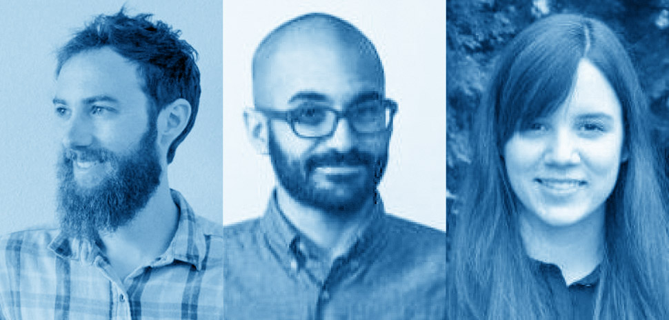
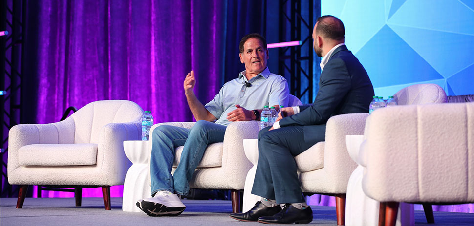
“Our researcher took us on a whole bunch of interviews with these people to get the project going,” said Shane O’Donnell, senior lead UX designer for AT&T, speaking on a panel at this year’s Big Design user experience industry event. Last week’s event included speakers from more than a dozen major corporations.
“Things became apparent right away,” O’Donnell said. “They (the techs) consider themselves to be craftspeople, and (they) talk about splicing strands of fiber together as an art. They have this tremendous pride. And a designer can relate to that.”
O’Donnell’s work, in part, concentrated on growing the dignity of the techs’ jobs.
“Their job is literally to build the internet,” he said at the panel discussion, which took place Sept. 9. “They have inherent dignity in their work, because they’re doing something useful.”
Yet one of the technicians’ primary tools was clunky, slow, and extremely linear—effectively rendering a quick, rote task into a half-hour waiting game. The techs—who have as much as 20 years of experience—created their own hacks.
“Sometimes, they even resorted to writing things on their hands in Sharpie,” said AT&T UX designer Kara Kenna, who also worked on the project.
Atlas helped speed such processes along, and filled other gaps (providing a tool in place of a permanent marker) as well. She said the techs became avid collaborators, even helping to develop the Atlas itself.
Fellow panelist and AT&T director of UX Andre Jolivette said central to the team’s purpose was to help the techs complete their jobs with a modular, easily updated app.
“Also, (we wanted to) do it in a way to preserve that pride of craft,” Jolivette said. “We went from that (previous) linear compliance machine … to a (sort of) Leatherman (multi-tool).”
The field techs assisted a great deal to develop Atlas, AT&T user experience team members said.
The panel was moderated by Ryan Lutterbach, assistant vice president of design at AT&T.
Last week’s virtual Big Design event hosted nearly 500 attendees, from across the U.S. and the world (including Africa, India, Poland, Greece, Iceland and the United Kingdom). Aside from AT&T, speakers included user experience/designers from Facebook, Uber, Microsoft, Intuit, NVIDIA, Wayfair, Pitney Bowes, Lucid, UNT, Dialexa, Home Depot, Sabre and Southern Methodist University.
To learn more about Dallas’ annual Big Design conference, click here.
![]()
Get on the list.
Dallas Innovates, every day.
Sign up to keep your eye on what’s new and next in Dallas-Fort Worth, every day.

