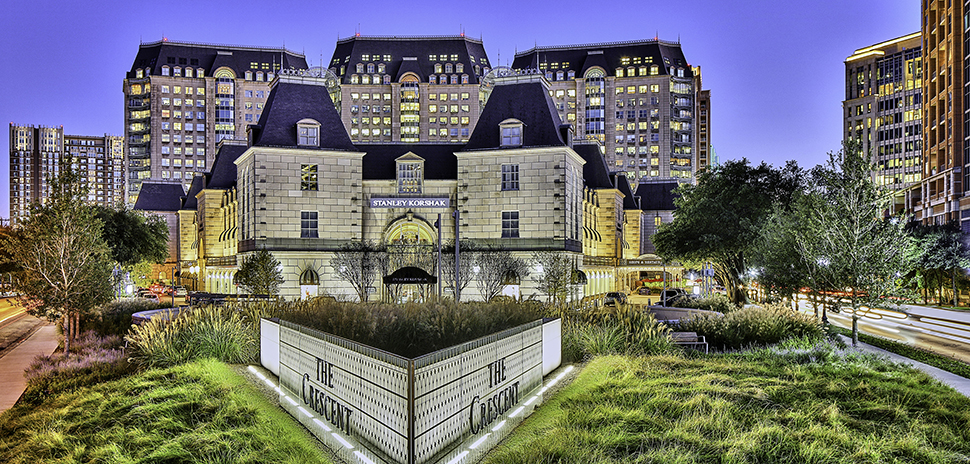
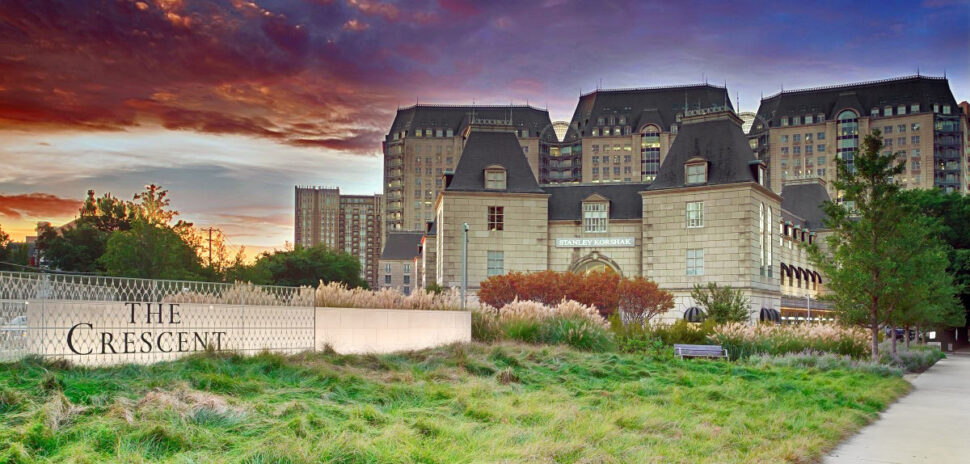
![]() A Dallas office complex that’s been a postmodern landmark since 1986 has gotten a $12 million makeover. The Crescent—a 10-acre complex designed by Philip Johnson and John Burgee—features over 1.1 million square feet of office space in three office towers, along with the Hotel Crescent Court, an upscale shopping center, and 11 fine dining and casual restaurants.
A Dallas office complex that’s been a postmodern landmark since 1986 has gotten a $12 million makeover. The Crescent—a 10-acre complex designed by Philip Johnson and John Burgee—features over 1.1 million square feet of office space in three office towers, along with the Hotel Crescent Court, an upscale shopping center, and 11 fine dining and casual restaurants.
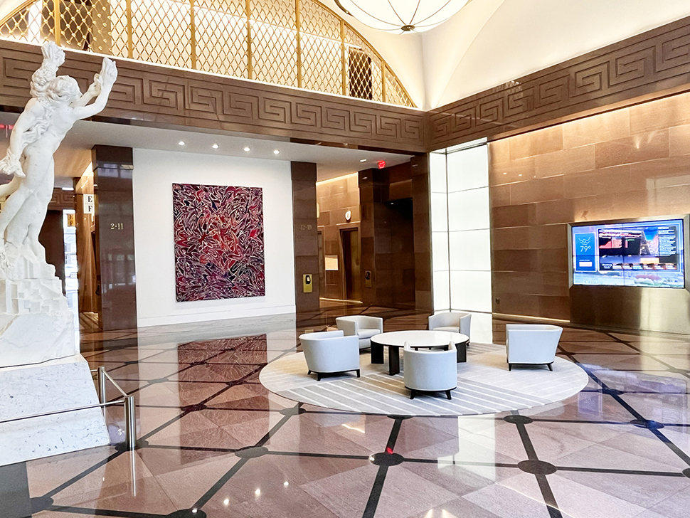
Now it also features something brand new: The first floors of all three office towers have been updated and enhanced with a new, contemporary, inviting look.
“The Crescent experience begins at our front doors. As our customers continue to return to the workplace, this is the perfect time to make some changes and add amenities to reflect the desires of those who work and visit The Crescent,” said John Zogg, managing director of Crescent Real Estate.
The renovation comes as The Crescent has brought its occupancy to over 96%, reinforcing its reputation as the “financial center of the Southwest.” The property recently announced a string of new leases, from UBS to JPMorgan Chase to an Investment Firm behind ‘Ghostbusters: Afterlife.’ In May alone, the mixed-use development in Uptown Dallas announced 81,860 square feet of total leases, including four new leases and four renewed leases signed by existing tenants.
Here’s a visual tour of the renovation, along with insights from the design teams behind it and from Crescent Real Estate LLC—which reacquired The Crescent for the third time in March 2021 and invested the $12 million for the renovation from its GP Invitation Fund II.
Project delivered by DLR Group and J|a Kreativ
[Photo: The Crescent]
Globally integrated design firm DLR Group and J|a Kreativ LLC led The Crescent’s interior renovation, with a goal of maintaining the integrity of Philip Johnson’s design and Caroline Rose Hunt’s vision.
General contractor Scott + Reid “worked meticulously to complete the project on time,” according to Crescent Real Estate, and in doing so exhibited “incredible detail consciousness,” according to J|a Kreativ.
“The success of this effort is that it is not decorated, but curated to harmonize with the iconic nature of the building project,” said Jo Staffelbach Heinz and Andre Staffelbach of J|a Kreativ. “By being timeless, understated and non-intrusive—in other words supportive of the newly created focal points—it is and will remain pleasing.”
‘Inviting, comfortable, and productive settings’
[Photo: The Crescent]
Art Bloodworth, principal and senior design leader at DLR Group, says the curated harmony will pay off in everyday benefits to The Crescent’s tenants and visitors.
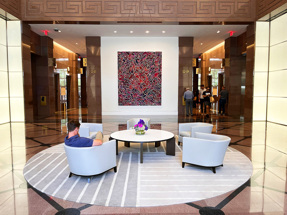
“The improvements also support best-in-class work environment expectations that will support office staff and visitors now and going forward,” Bloodworth told Dallas Innovates, including “lighter, brighter arrival areas, connection zones and transfer spaces balanced with hospitality driven lobby environments that offer inviting, comfortable, and productive settings to get away from your office while staying on the property.”
‘The design of timeless environments’
[Photo: The Crescent]
This wasn’t the first time Andre Staffelbach has renovated an historic property, balancing the weight of history with an embrace of contemporary improvements.
“Having participated in the rejuvenation of iconic properties in my early stages of my career in Switzerland, I had the benefit of understanding the design of timeless environments,” Staffelbach said. “It requires a simple approach to the envelope—interior architecture—and establishing very few focal points to not create visual conflict.”
Staffelbach said The Crescent project involved “an intense study” of the history of The Crescent, the architectural products currently in place, the complex’s present and future occupants, as well as the office buildings’ neighbor, the Hotel Crescent Court.
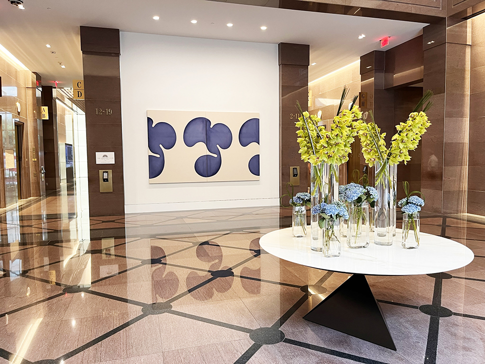
The renovation’s key elements involved lightening up and refreshing the three lobbies and the concourse, and replacing art installed at the inception of the project, Staffelbach said.
The Crescent celebrated history at its inception
[Photo: The Crescent]
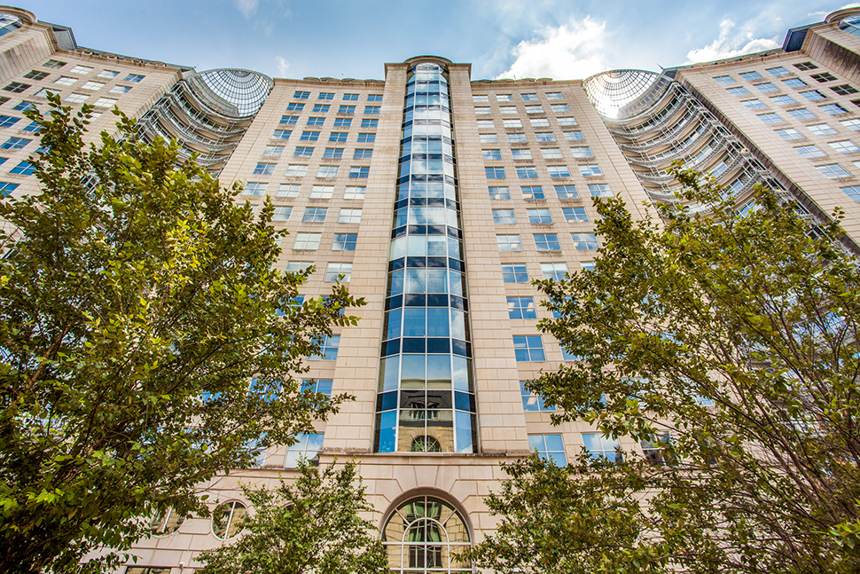
DLR Group’s Bloodworth noted that even at its inception in the 1980s, The Crescent was created with a sense of history, and preserving that element was a mission of the renovation.
“At its opening, The Crescent was hailed as ‘A celebration of Art, History and Architecture,'” Bloodworth said. “It was important to everyone on the team to keep its character and beautiful detailing intact, while addressing the concern with light levels and comfortable gathering spaces. This, and the fact that the three office towers each have a north and south lobby connected with long concourse corridors.”
All those lobbies and corridors featured an “immense amount of royal pink marble and bright bronze detailing on every surface,” Bloodworth said, adding that “the team focused on the areas of intervention that would have the most impact while existing comfortably with much of the original material palette.”
Lighting it all up, and offering ‘elegantly subdued’ seating
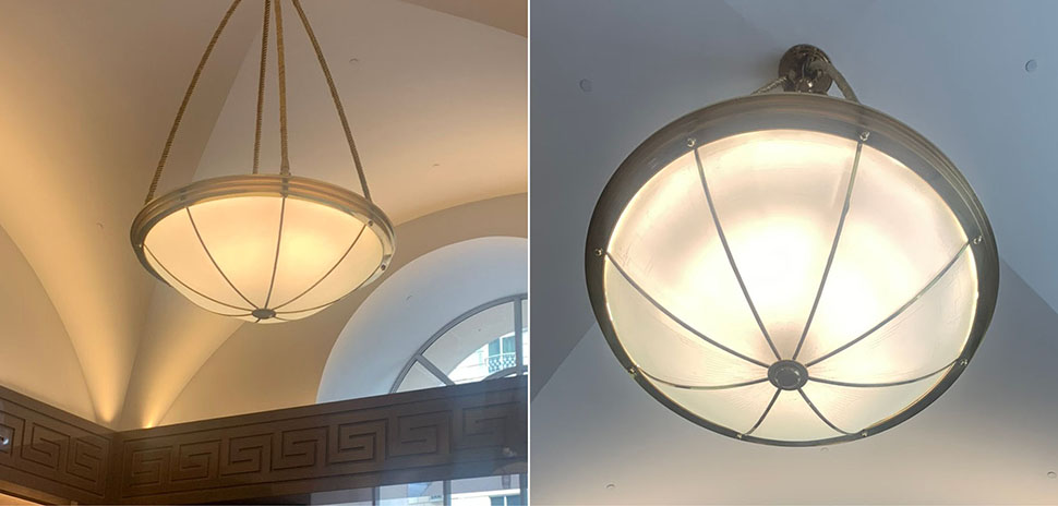
Updated pendant lighting fixures (right) are brighter and whiter than before (left). [Photos: The Crescent]
Back in 1986, modern LED lighting and all its possibilities weren’t yet available. To create a bright and airy ambiance throughout the Crescent lobbies and corridors, the existing 1″-by-1″ mosaic tile ceilings were raised eight inches and replaced with “beautifully finished and painted surfaces adorned with upgraded pendant fixtures, LED lighting coves, directional lighting and floor-to-ceiling lighting panels.” Bloodworth said.
The J|a design team sought to replace the existing lighting with a more modern “glow.”
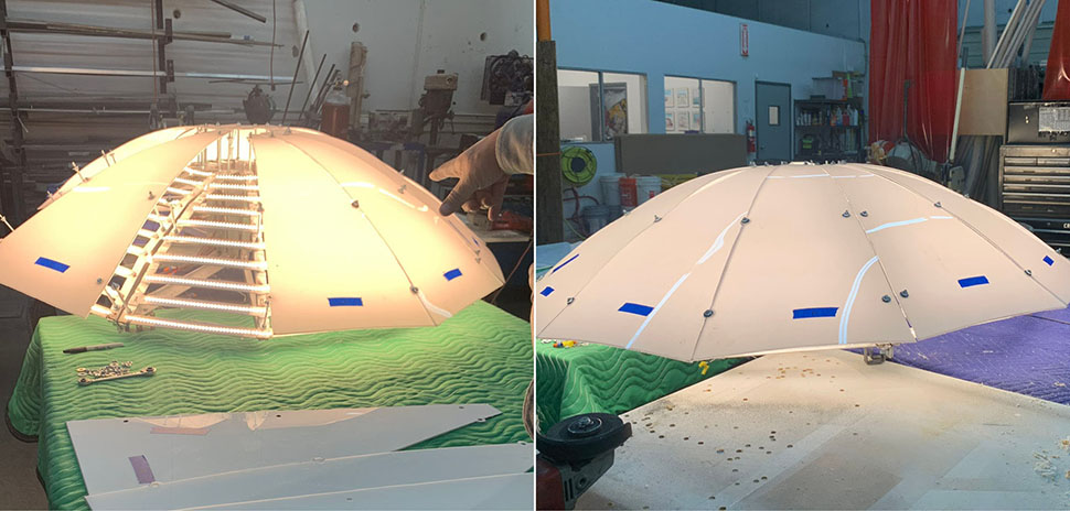
A glimpse of the renovation process: Updated pendant lighting fixures (right) are brighter and whiter than before (left). [Photos: The Crescent]
“Not only did these original pendants not produce adequate light, the individual lamps within the fixtures were visible,” said Staffelbach and Staffelbach Heinz. “Monte Martin of Martin & Martin Design redesigned the total interior within the existing glass face and refitted them with LED lighting for a total uninterrupted glow. In addition, the ceilings were addressed and LED up-lights were installed to lighten and brighten these lobbies.”
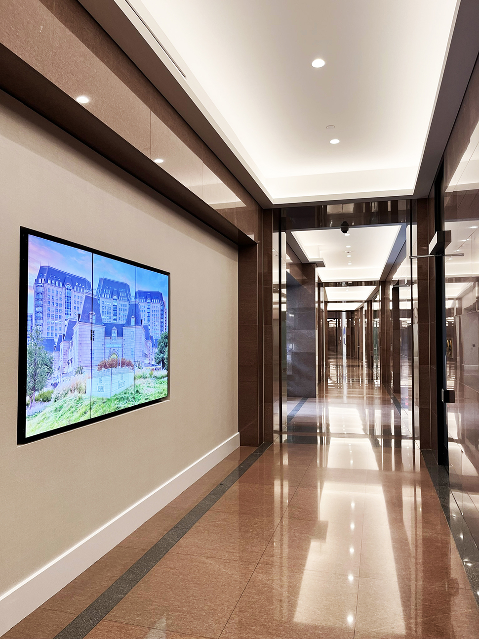
Lighter, brighter corridors. [Photo: The Crescent]
The new lighting system makes the corridors between the lobbies much brighter and more inviting.
‘Elegantly subdued furnishings’
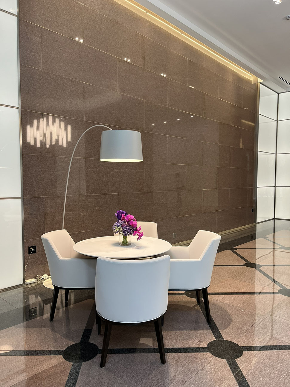 High-end, contemporary furnishings in “elegantly subdued shades”—from benches and individual seating to a variety of tables—were also added to provide appealing workspaces for visitors or tenants making calls or having informal meetings outside their offices.
Newly commissioned art works
[Photo: The Crescent]
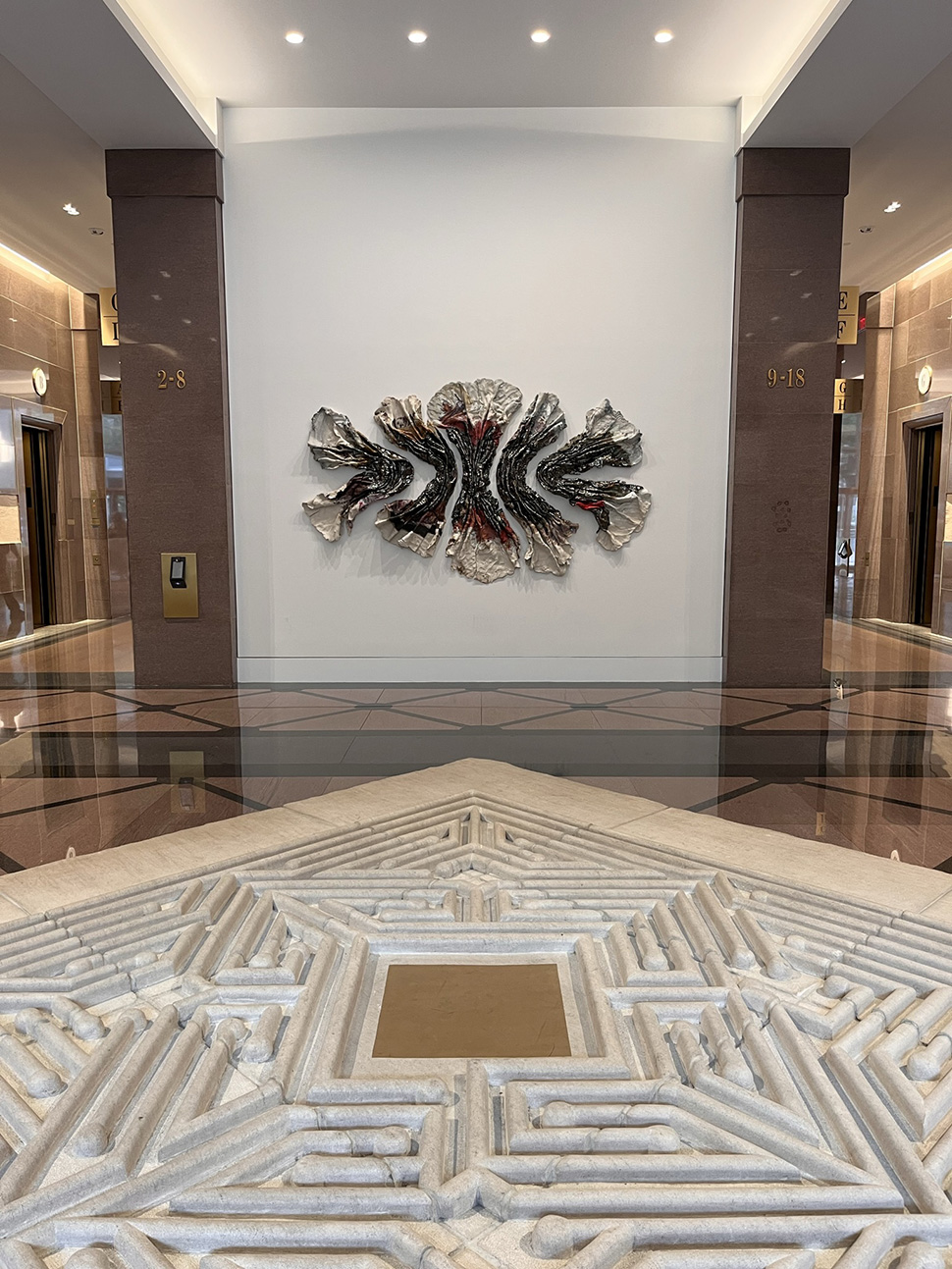
The original Crescent was essentially a massive palette for art works. That tradition carries on in a mix of both existing and newly commissioned works.
“The original office tower lobbies were designed as majestic spaces, scores of stone walls and floors, minimal and dramatic lighting, and void of any furniture,” Bloodworth noted. “The architecture was immense, but it allowed focus on the artworks commissioned for each space. I’m very happy with the Crescent team’s focus to preserve the impressive Brad Goldberg sandstone sculpture series in two of the main tower lobbies and have them restored and lit by our lighting team to bring them to a new level.”
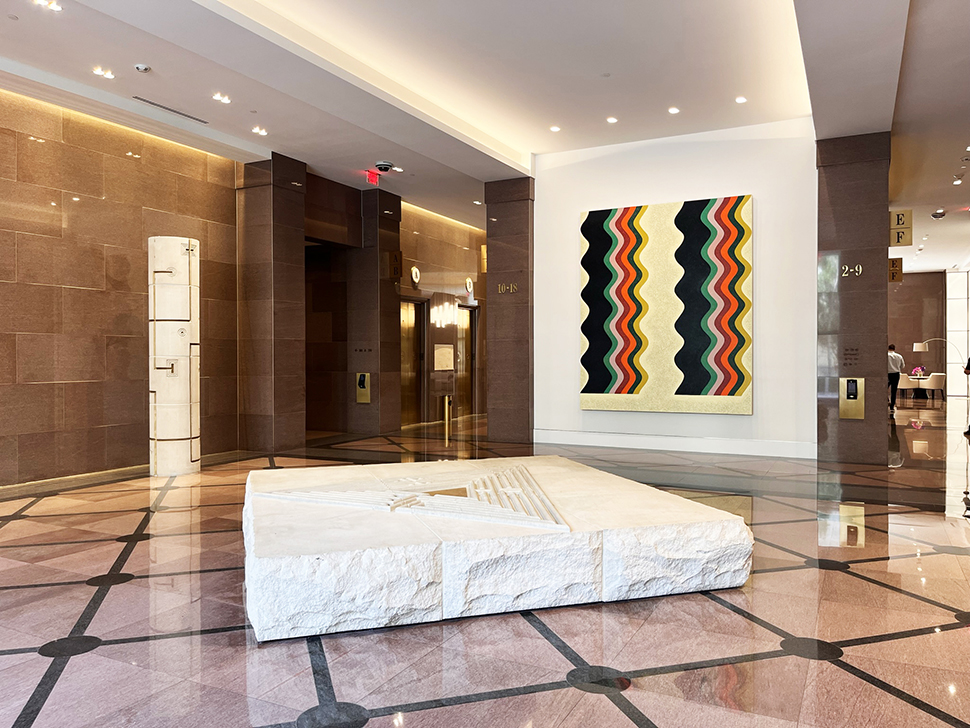
But what many visitors will notice are all the new art works that have now been introduced.
[Photo: The Crescent]
The renovated lobbies feature new, original artworks created by several nationally known artists, including contemporary sculptor Brie Ruias, a Brooklyn-based artist who creates large-scale abstract ceramic pieces; Landon Metz, a New York-based artist whose practice is defined by dynamic, minimalist forms and contained fields of washed-out color; Saif Azzuz, a Libyan-Yurok artist whose paintings explore the interconnected and dynamic practices of Indigenous land management; and Matt Kleberg, whose Fort Worth upbringing and South Texas ranching roots influence his boldly colored geometric paintings.
The new, large-scale artworks were sourced by Runyon Arts, which worked with Crescent ownership to carefully review and select for each new lobby gallery wall.
“These pieces have transformed the space and are supported by our design team’s collections of bespoke furniture groupings and area rugs, designed to complement the quality and the scale of each grand lobby while harmonizing with the iconic interiors of The Crescent office towers,” Bloodworth added.
New fitness center
Another element of the renovation is a brand-new fitness center located in the atrium in the proximity of the Capital Grille and Sixty Vines. An exclusive amenity for those who work at the complex., it was conceived by ENTOS Design and is described by Crescent Real Estate as “a sleek and luxurious fitness center with floor-to-ceiling windows and wide-open spaces, accompanied by beautiful wood ceilings and marble surfaces that make the fitness center an oasis for those seeking health and wellness.”
Note: The paragraph above has been updated to include the location of the new fitness center.
![]()
Get on the list.
Dallas Innovates, every day.
Sign up to keep your eye on what’s new and next in Dallas-Fort Worth, every day.

