How do you design a home, a museum, a school and more not just to serve their functions, but to move and inspire all who see them? Earlier this month, the Dallas chapter of the American Institute of Architects announced the 2022 winners of its annual Built Design Awards—celebrating work that does exactly that.
Announced at the Architecture and Design Exchange in downtown Dallas, the Built Design Awards celebrate outstanding achievement in architectural design by AIA Dallas chapter members and AIA Northeast Texas section members.
The international 2022 jury included architects Kim Yao, FAIA, principal at Architecture Research Office LLC in New York; Andrea Leers, FAIA, co-founder and principal of Leers Weinzapfel Associates in Boston; and Omar Gandhi, AIA, principal/owner at Omar Gandhi Architect in Halifax, Nova Scotia.
Seven projects were selected for this year’s Honor Awards. An additional four Critic’s Choice Award winners were selected by Mark Lamster, the architecture critic at The Dallas Morning News.
‘Thoughtful architecture that enlivens the fabric’ of communities
“Each year the work of our AIA Dallas community becomes stronger and more impressive, and that work was on full display at our design award’s event,” Kalman Nagy, AIA, chair of the AIA Dallas Design Awards Committee, said in a statement. “Our jurors selected a diverse range of project typologies and felt that these projects presented thoughtful architecture that enliven the fabric of their communities.”
AIA Dallas 2022 Built Design Honor Award Winners
This year, the Design Awards showcased design excellence from sustainability to resiliency to inclusivity.
Here’s a look at what could transform the face and future of downtown Dallas, Dallas neighborhoods, and two other cities:
Holocaust Museum & Garage, by OMNIPLAN
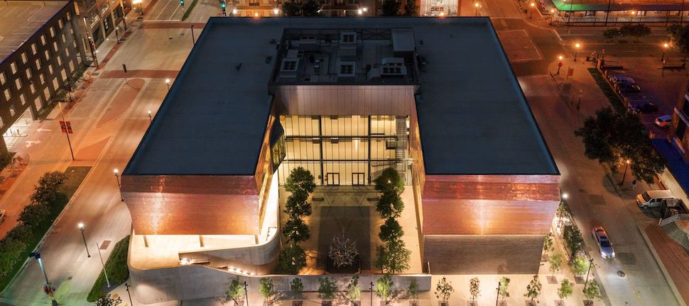
Dallas Holocaust and Human Rights Museum. [Rendering: OMNIPLAN]
The Dallas Holocaust and Human Rights Museum—located in downtown Dallas’ historic West End district—has a mission of teaching the history of the Holocaust and advancing human rights. OMNIPLAN’s overall building design aims to amplify the museum’s narrative “by leading visitors through a physically changing path with a series of highly experiential spaces that allow the visitors to fully absorb the exhibits.”
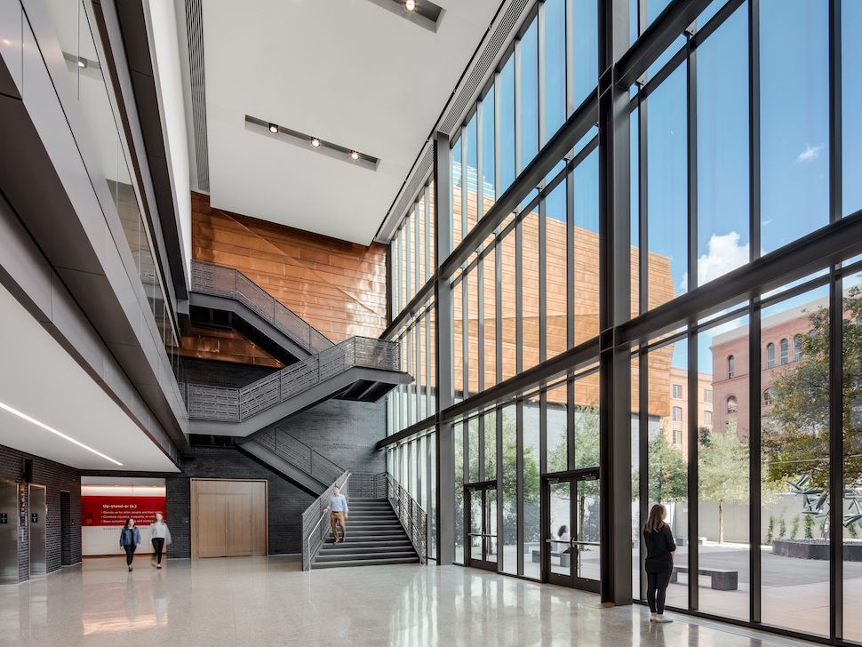
Lobby of the Dallas Holocaust and Human Rights Museum. [Image: OMNIPLAN]
“The architecture is essentially reflective of this notion of a journey,” OMNIPLAN said in a statement, “expressive of movement from arrival to departure, designed to provide an intuitive path for all visitors so that the focus is on the experience that is removed from everyday distractions.”
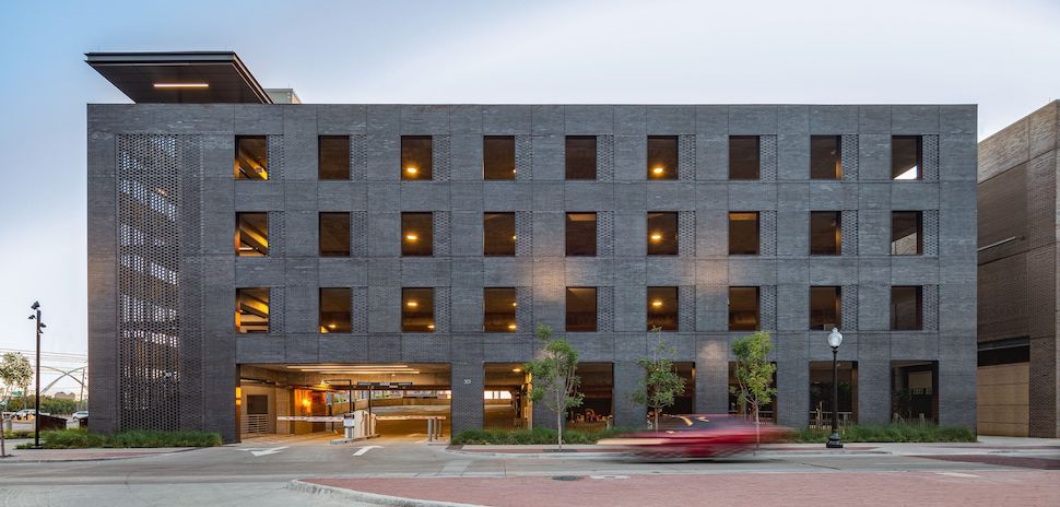
Garage of the Dallas Holocaust and Human Rights Museum. [Image: OMNIPLAN]
In OMNIPLAN’s design of the building, the garage (above) was far from a second thought. It was considered part of the journey to the museum, with the dark brick used on both foreshadowing the solemn content the viewer is about to experience.
Casa Campo, by Wernerfield
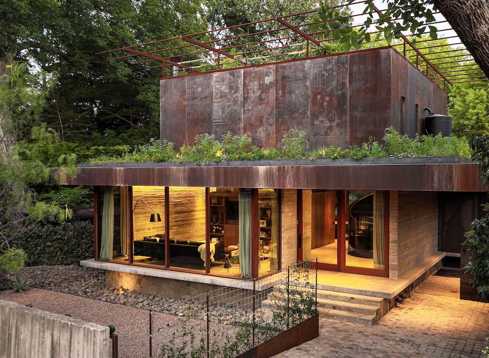
Casa Campo, a Dallas residence designed by Wernerfield. [Photo: Wernerfield]
“Casa Campo was designed to replace a small 1,100 square foot cottage home that the client had lived in on the property for nearly 20 years,” Wernerfield said in a statement about the Dallas residence.
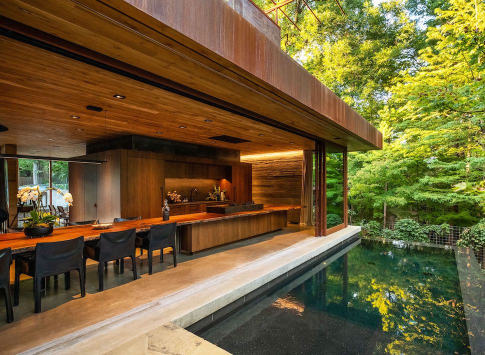
Casa Campo opens to the outdoors [Photo: by Wernerfield]
“The client, an avid gardener and beekeeper, required that the new home retain as much of the existing landscape as possible, create a strong connection to nature and incorporate design features that would promote pollinators,” the firm added.
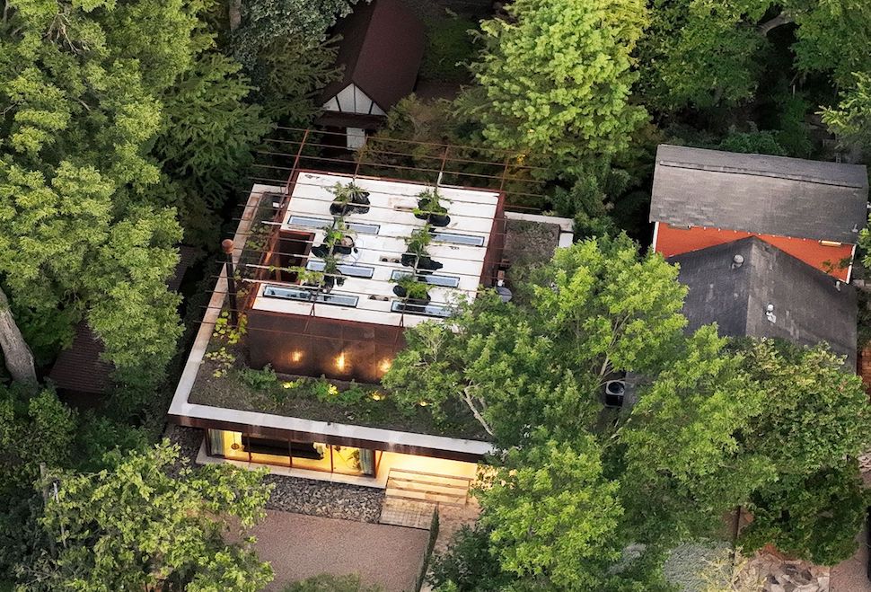
Casa Campo roof garden [Photo: Wernerfield]
“The strategy of utilizing the footprint of the old home and developing the design program vertically was taken. A roof garden with native wildflowers surrounds the second-floor level and an expansive trellis feature that will fill with native flowering vines hovers above the home like a ‘flower cap.'”
Nathaniel Hawthorne Elementary School, by Glenn Partners
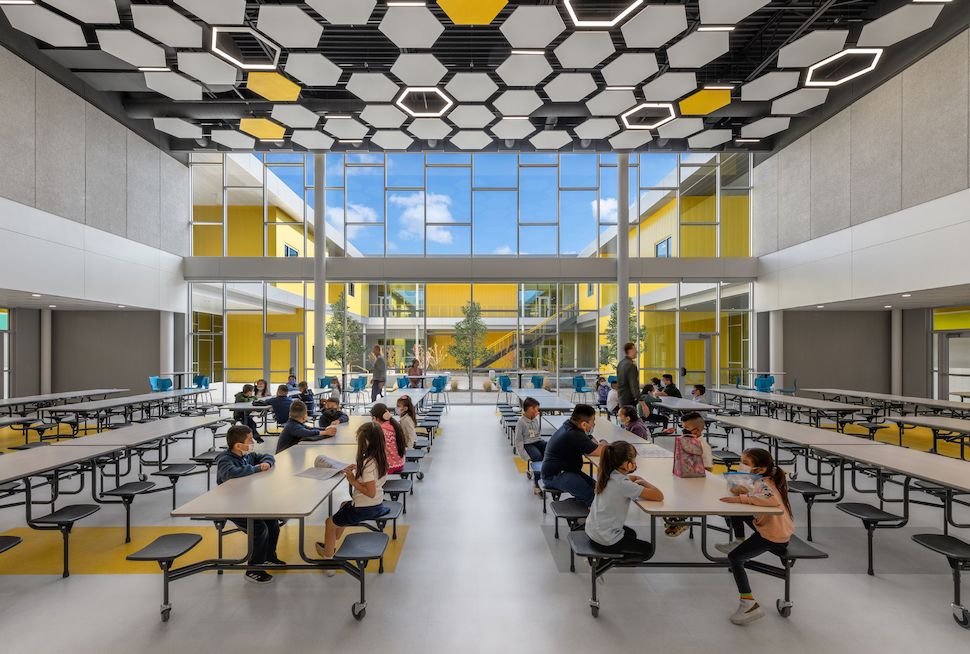
Nathaniel Hawthorne Elementary School, designed by Glenn Partners [Image: Glenn Partners]
Dallas ISD’s Nathaniel Hawthorne Elementary School was named after one of America’s most famous novelists—and Glenn Partners took that inspiration and ran with it.
“Similar to Hawthorne’s use of allegory to reveal a hidden meaning in his novels, the school presents a reserved façade to the neighborhood while a journey within reveals a nest containing a hive of activity surrounded by layers of shade and protection,” Glenn Partners said in a statement.
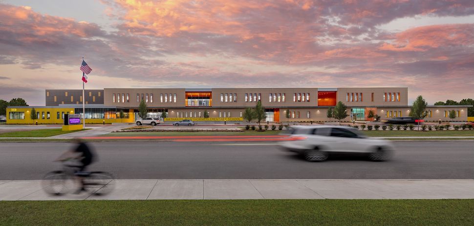
Nathaniel Hawthorne Elementary School. [Image: Glenn Partners]
The new, $29,.9 million campus at 7800 Umphress Road in Southeast Dallas, “provides safe, collaborative, serendipitous interior student-centered spaces that are open and welcoming while strengthening the union of students, parents, and teachers,” according to the Dallas ISD.
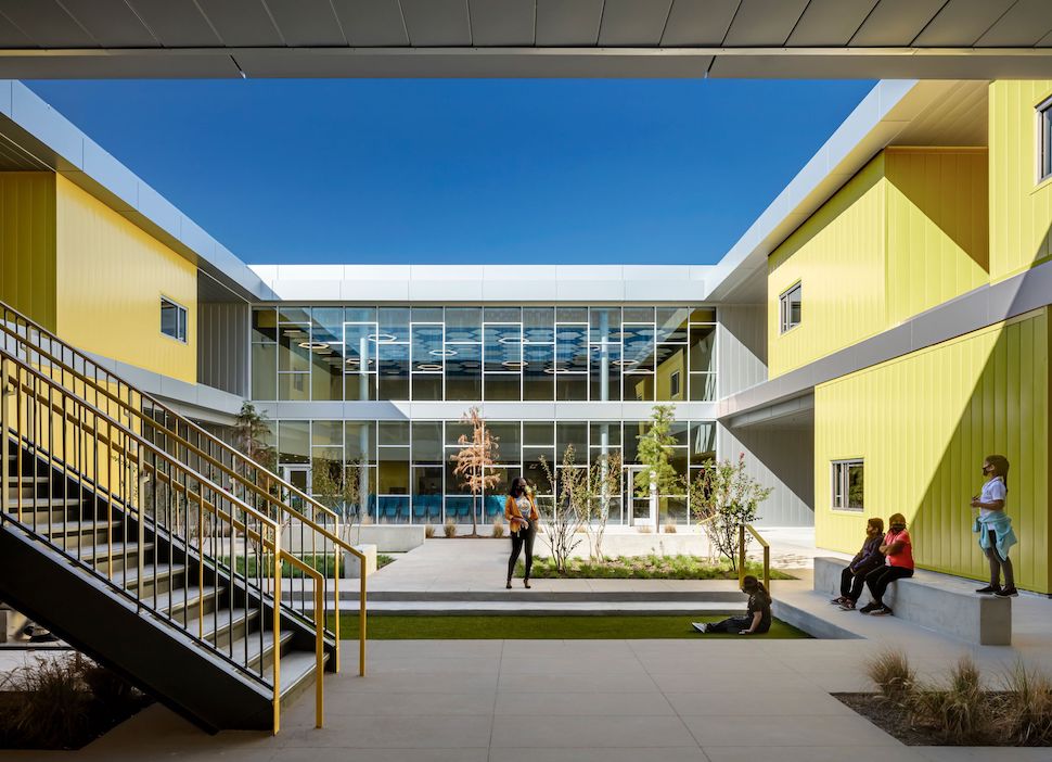
Nathaniel Hawthorne Elementary School. [Image: Glenn Partners]
“Supporting a simple planning approach of three striated bars, the school’s public programs are in the center protected by private academic spaces at the periphery. A sense of porosity along the exterior reveals the highly active inner collaborative public environment or hive.”
Oklahoma University Medical Center Expansion, by Perkins&Will
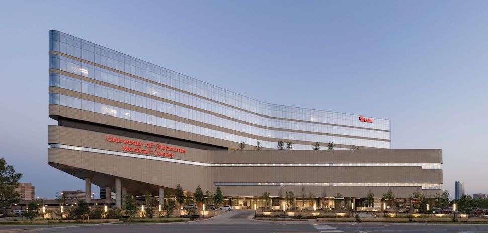
Oklahoma University Medical Center Expansion by Perkins&Will [Photo: Perkins&Will]
“The Oklahoma University Medical Center expansion is designed to be a world-class healing facility that is at once resilient and poetic, using natural forms to enhance the healing process,” Perkins&Will said in a statement.
“Oklahoma’s only Level I Trauma Center, OU Medical Center consistently receives an acute volume that exceeds its current capacity. To meet this need, the hospital planned a new 144-bed patient tower with 32 new operating rooms.”
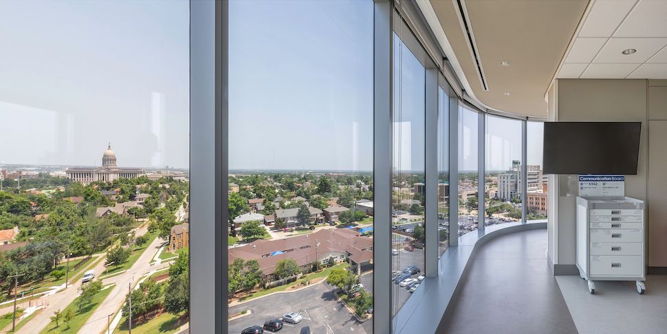
OU Medical Center Expansion. [Photo: Perkins&Will]
“The building form evolved out of a desire to connect the building to its site—it creates an iconic reference to the wind-shaped natural formations of Oklahoma, helps reduce the visual bulk of the tower, and maximizes views toward local landmarks, such as the OU Medical Center campus, the downtown Oklahoma City skyline, and the Oklahoma State Capitol building.”
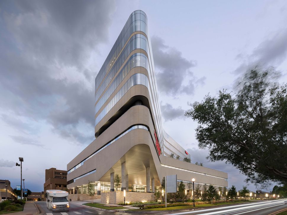
OU Medical Center Expansion [Photo: Perkins&Will]
“Connectedness is an experiential theme. Recognizing the healing power of nature, visual and physical connections to vegetated outdoor spaces are distributed throughout the project; sightlines permeate the bed tower floors to maintain a sense of openness and visual relation to the surrounding neighborhood; and an outdoor courtyard and glazed circulation path form a seamless, light connection to the existing facility.”
All Saints Dallas church, by Cunningham Architects
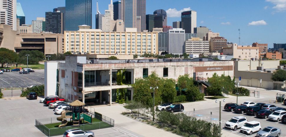
All Saints Dallas church, designed by Cunningham Architects [Image: Cunningham Architects]
For this project, a decaying former auto dealership at 901 S. Ervay near downtown Dallas was “rehabilitated” into the new home for All Saints Dallas, a Three-Stream Anglican church.
Cunningham Architects’ overall goal was to preserve as much of the original structure as possible, “while providing adequate program spaces and modern innovations to serve the church’s growing congregation.”
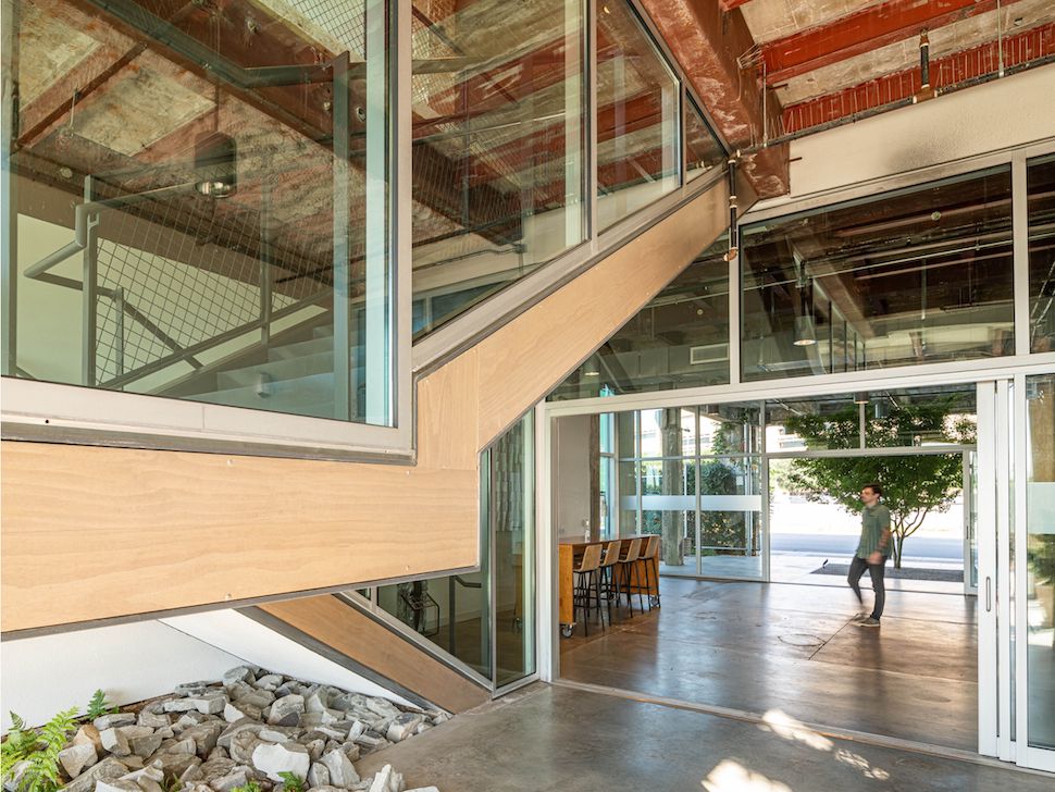
All Saints Dallas entry court. [Image: Cunningham Architects]
“The most significant intervention was the removal of several bays of exterior masonry walls to provide two exterior entry courts, one facing the parking and the other facing downtown,” the firm said. “Both courts access a central interior lobby through large sliding glass doors. When the sliding doors are opened, the building completely opens up to create a large interior/exterior gathering space.”
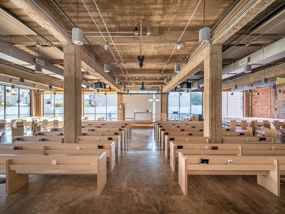
All Saints Dallas sanctuary [Image: Cunningham Architects]
“This open entry area funnels congregants through the building towards a new sanctuary. The sanctuary is a simple space with large glass windows around the perimeter, framed by exposed building structure,” Cunningham Architects said. “The remainder of the building serves as administrative offices and flexible gathering spaces.”
Merrilee Lane home, by Max Levy Architect
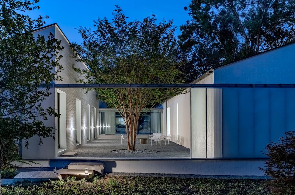
Merrilee Lane home designed by Max Levy Architect [Photo: Max Levy Architect]
The setting of this private home in Dallas was a featureless lot in “a modest 1950’s suburban neighborhood.” At a time when many new homes are built to be colossal structures, the client requested something of more modest size, but striking in its modern impact: an 1,877-square-foot two-bedroom house.
This project also won an AIA Dallas 2022 Critic’s Choice Award.
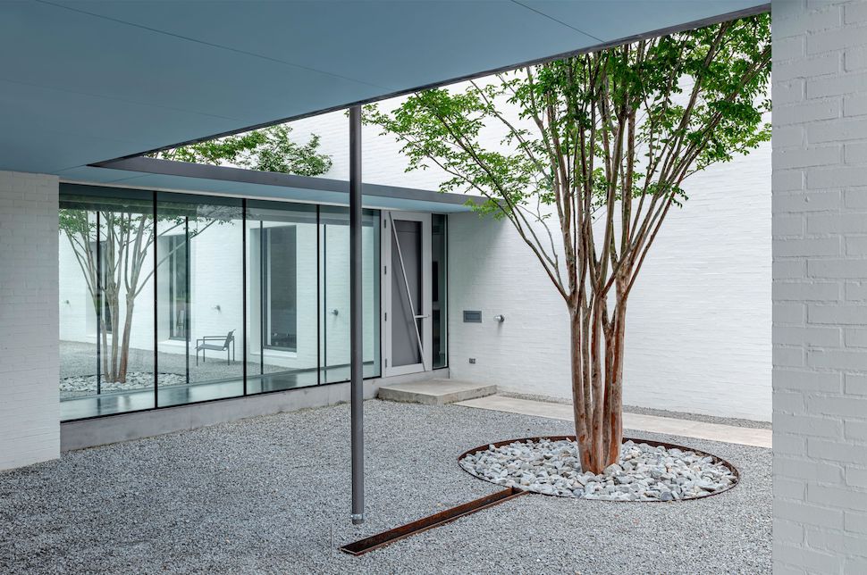
Merrilee Lane home [Photo: Max Levy Architect]
“A row of trees runs through the middle of the house. The forms of this house and its gutter/downspout/runnel design concentrates rainwater directly to the courtyard trees and to plantings that provide privacy,” the firm said.
Light was a central consideration of the home’s design, the firm said: “The floor plan parts to admit a central swath of natural light. Each room therefore enjoys light from two directions.”
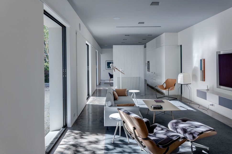
Merrilee Lane home interior [Photo: Max Levy Architect]
“A great deal of energy can be saved by turning off mechanical equipment in mild weather,” Max Levy Architect noted. “The courtyard is lined with a series of sliding glass doors which pocket into the walls. These, in concert with the building’s unusually slender forms and operable perimeter windows, foster breezes through the house.”
Eastside Regional Recreation Center, by Perkins&Will in association with in*situ architects
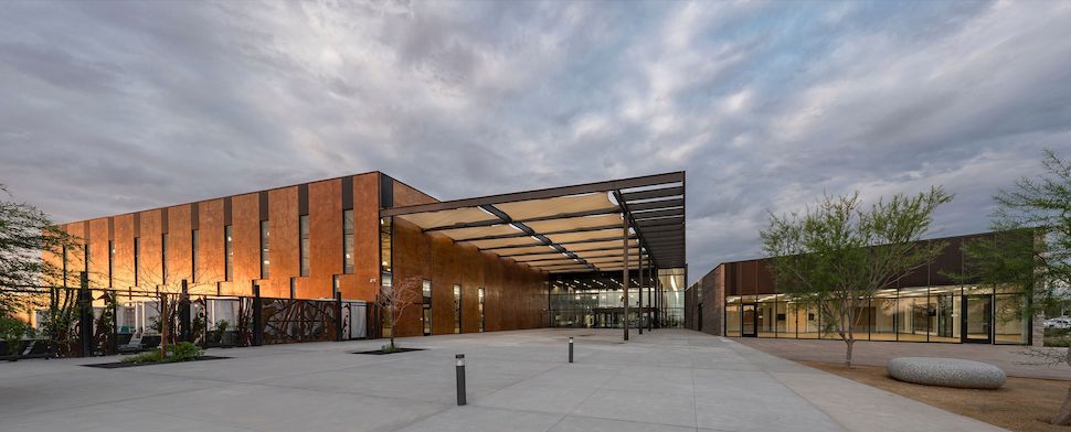
Eastside Regional Recreation Center in El Paso, designed by Perkins&Will in association with in*situ architects [Image: Perkins&Will]
Located in El Paso, the design of this recreation center “seeks to transform an extreme, high-altitude desert basin into an inviting social sanctuary for the community,” Perkins&WIll said.
“Located in a fast-growing part of the Chihuahuan Desert on the east side of El Paso, the new recreation center is the first component of a 92-acre regional park for a historically ignored, multi-generational population. It provides a competition-class aquatics facility, gymnasium, senior center, outdoor aquatics park, and a public art installation.”
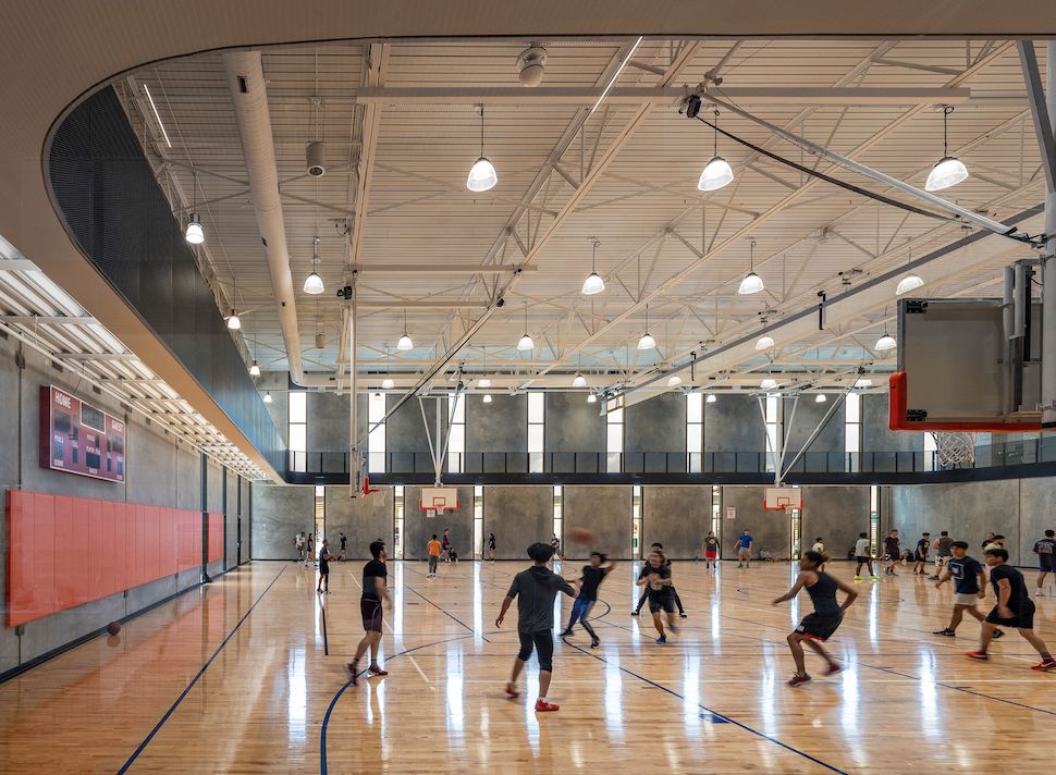
Eastside Regional Recreation Center in El Paso, designed by Perkins&Will in association with in*situ architects [Image: Perkins&Will]
“Public design meetings resulted in a concept that consolidates the citizens’ insights into a formal expression which reflect the colors, forms, and natural light of the desert environment,” Perkins&Will said.
“Modulation of light is a strategy that reinforced the design concept throughout the project. Shade structures provide relief from intense desert sun, while allowing exterior activities, and transitioning between outside and inside.
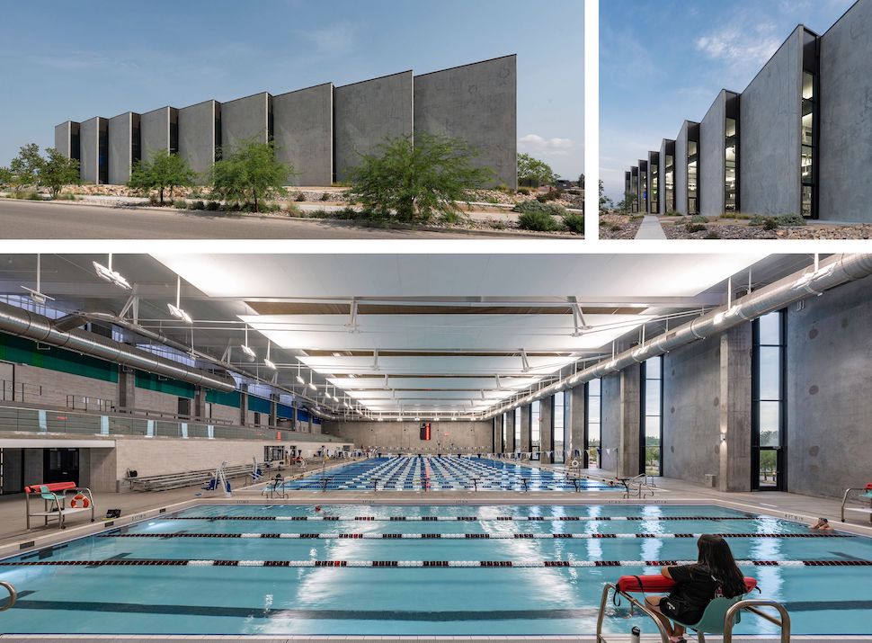
Eastside Regional Recreation Center in El Paso, designed by Perkins&Will in association with in*situ architects [Image: Perkins&Will]
“Articulation of humble materials—tilt-wall concrete, wood slats, and perforated metal—filter light and views throughout the interior in ways appropriate to the desert context. In support of a city driven colored lighting initiative, the south façade is illuminated at night, transforming into a beacon for the neighborhood.” Local, water-conserving vegetation and arroyos surrounding the building, minimize water requirements.”
2022 AIA Dallas Critic’s Choice Award Winners
One of the 2022 Built Design Honor Award Winners above also made the list of this year’s Critic’s Choice Awards: Merrilee Lane, by Max Levy Architect. Here are the three other Critic’s Choice winners:
Hall of State at Fair Park renovation, by Gensler
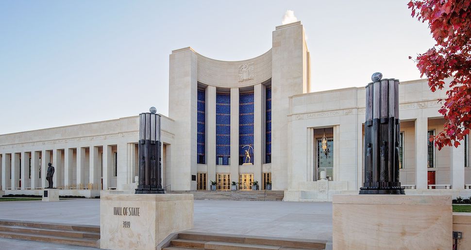
Hall of State at Fair Park renovation, by Gensler. [Photo: Gensler]
“The renovation of Fair Park’s Hall of State brings an iconic landmark of Texas history back to its breathtaking glory,” Gensler said in a statement. “Fair Park was originally built in 1936 to mark the centennial anniversary of the Republic of Texas. It’s one of the most representative examples of art deco architecture in the state. Listed on the National Register of Historic Places and designated a State Antiquities Landmark by the Texas Historical Commission, it is, along with the Alamo and the State Capitol, one of three defining icons of Texas architecture.”
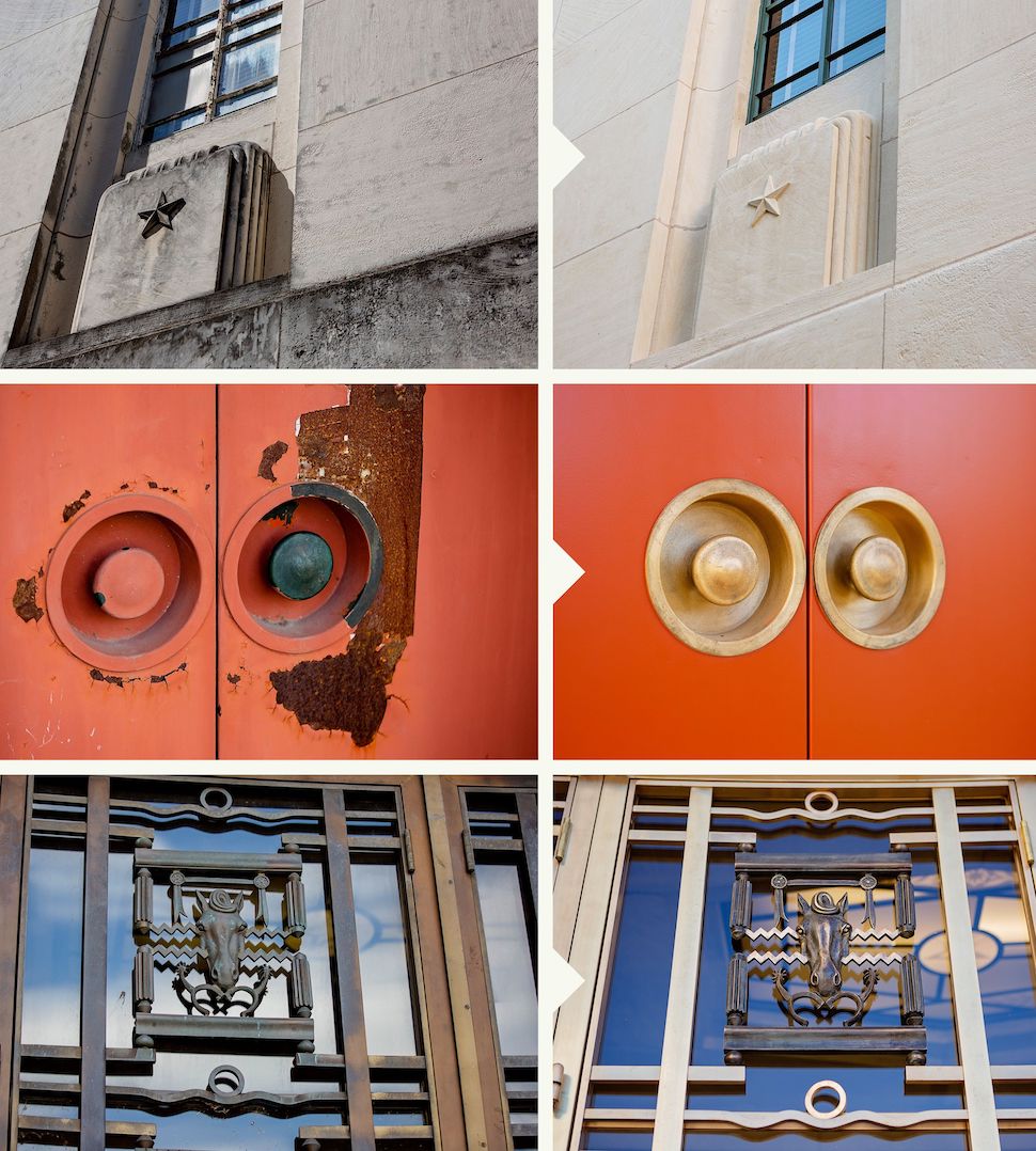
Hall of State at Fair Park before and after the Gensler renovation. [Photos: Gensler]
“Forgotten over the years, Hall of State fell into disrepair despite its importance. Working with a cost estimator to add value on a restricted budget, [Gensler’s] architectural design and restoration teams focused on beautifying and refurbishing the building.”
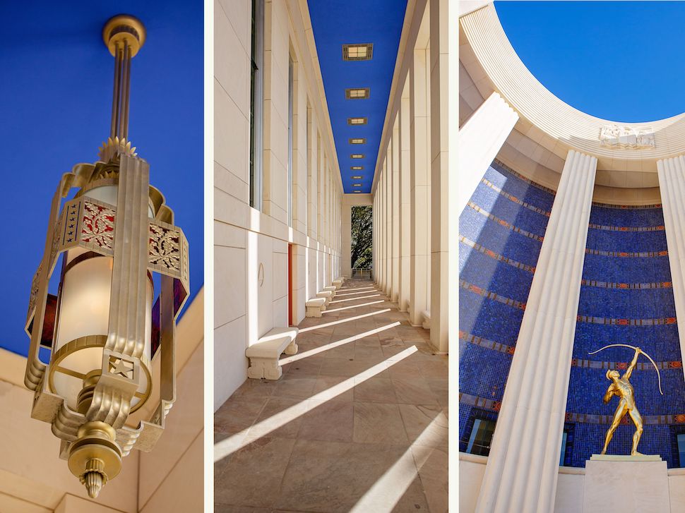
Hall of State at Fair Park renovation, by Gensler. [Photo: Gensler]
“Navigating a historical renovation project of this scale was the most challenging aspect of the project,” Gensler said. “The transformation showcases brightened facades, new lighting, historical materials, improves waterproofing, efficiency and maintenance procedures, and upgrades accessibility to ADA code requirements. Enhancing the existing murals, artifacts, state, and national treasures, new exhibits, and objects—including a flag that originally flew over the Alamo—are also included within to engage the public.”
Miramar Residence, by Oglesby Greene Architecture
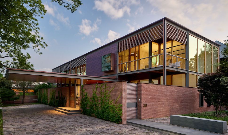
Miramar Residence, a home in Dallas designed by Oglesby Greene Architecture [Image: Oglesby Greene Architecture]
Oglesby Greene says its clients requested that this Dallas home have “abundant natural light and fresh air, seamless transitions between inside and out, along with a preference for warm modern space.”
“Embracing an extensive eastern street frontage, the home recesses as a simple form well behind its permitted building line,” the firm said. “A layering of site elements and spaces filter visitors from public to private.”
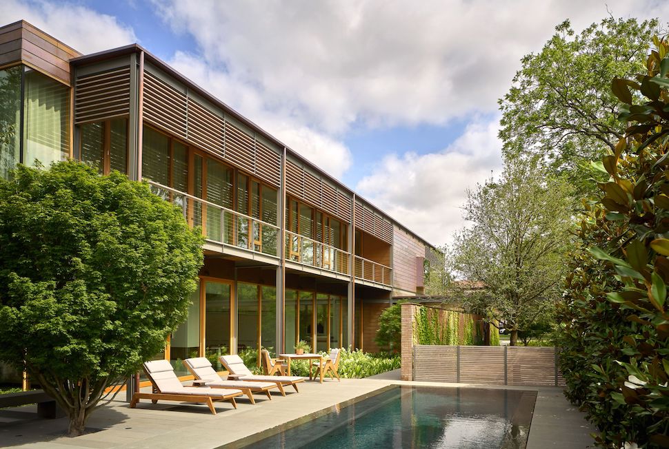
Miramar Residence pool and exterior. [Image: Oglesby Greene Architecture]
“Masonry walls were introduced to define intimately scaled gardens, balancing the desire for both transparency and privacy at select ground level spaces. Pool, deck and adjoining fern garden are anchored to the south by a single-story garage and guest suite.”
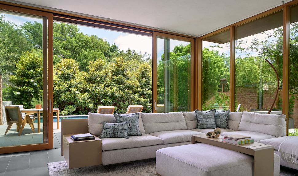
Miramar Residence interior. [Image: Oglesby Greene Architecture]
“Full height high performance glass at both levels is protected along the east facade with a continuous balcony and brise soleil structure, providing morning shade and shielding openings from rain,” Oglesby Greene said. “The roof is covered in photovoltaic panels, shading the membrane and offsetting energy usage which is minimized by integral LED lighting and high efficiency VRF air conditioning. The west facade has limited openings protected by motorized shades. The material palette includes Roman brick, copper, Douglas Fir, Sapele, expressed structural steel and Bluestone paving throughout.”
New House in the Neighborhood, by Shipley Architects
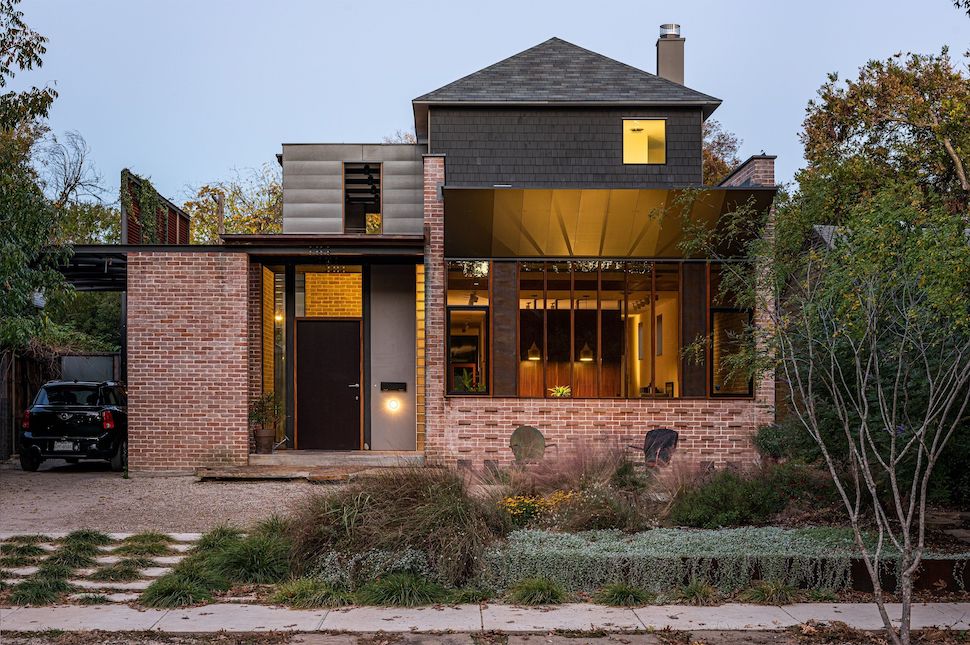
New House in the Neighborhood, by Shipley Architects [Photo: Shipley Architects]
This newly constructed 2,800-square-foot single family house is located in a 1930s Dallas neighborhood, surrounded by an “eclectic mix of arts-and-craft bungalows.”
“Though modern in terms of space, the house embodies tradition with regard to scale and massing in order to fit into the neighborhood texture,” Shipley Architects said.
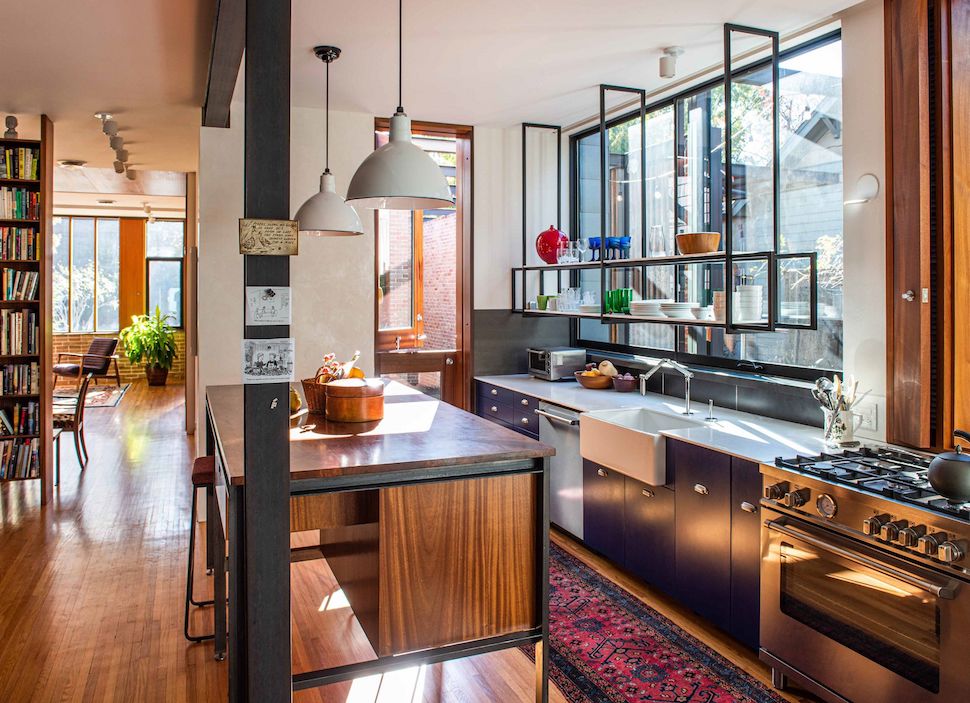
Kitchen of the New House in the Neighborhood. [Photo: Shipley Architects]
“The long, narrow plan is shifted to the northeast property line in order to create a series of outdoor porch and court spaces along the sunny southwest side-yard. A twenty-foot-tall screen of perforated corrugated corten provides privacy from the neighboring house,” the firm said.
“In lieu of a street facing garage cantilevered steel beams support a series of flat arch sheet metal panels which provide a pavilion-like shelter for cars. The brick portions of the house are load-bearing cavity walls.”
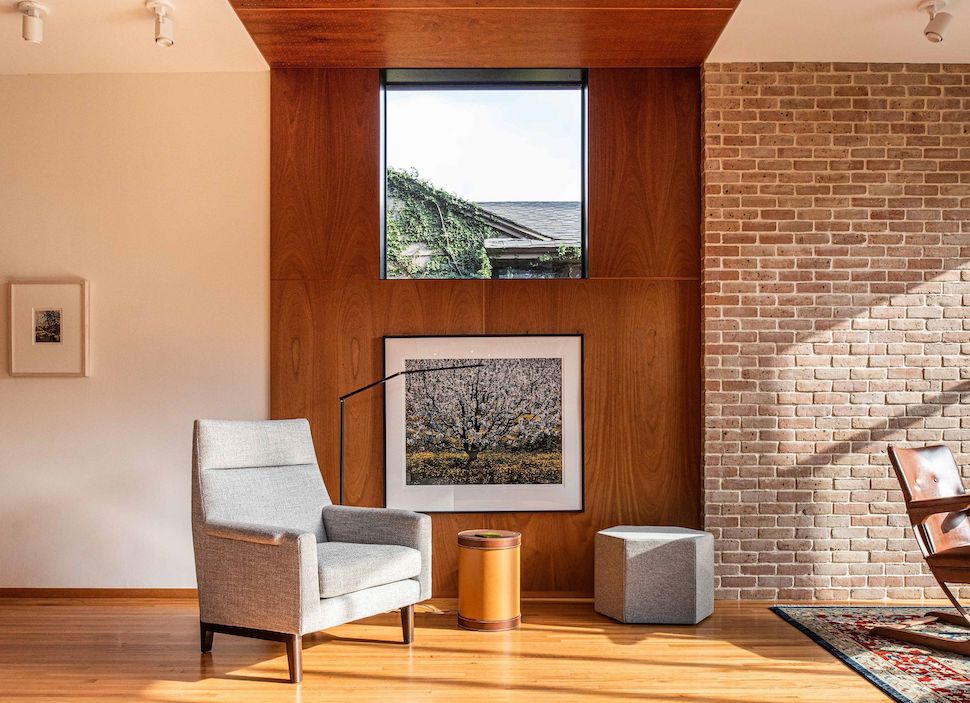
New House in the Neighborhood interior [Photo: Shipley Architects]
“The upturned front soffit is clad in anodized aluminum panels. The flooring of the belvedere is patterned concrete tile. Traditional painted wood shingles comprise the balance of the exterior materials. The interior uses a variety of woods including mesquite, mahogany, and fir. Windowsills and various trim items are powder-coated aluminum. Much attention is given to materiality, detailing, and joinery.”
![]()
Get on the list.
Dallas Innovates, every day.
Sign up to keep your eye on what’s new and next in Dallas-Fort Worth, every day.


